Isaiah ETN | Concept Project | Kiehl’s Rebrand | 2026
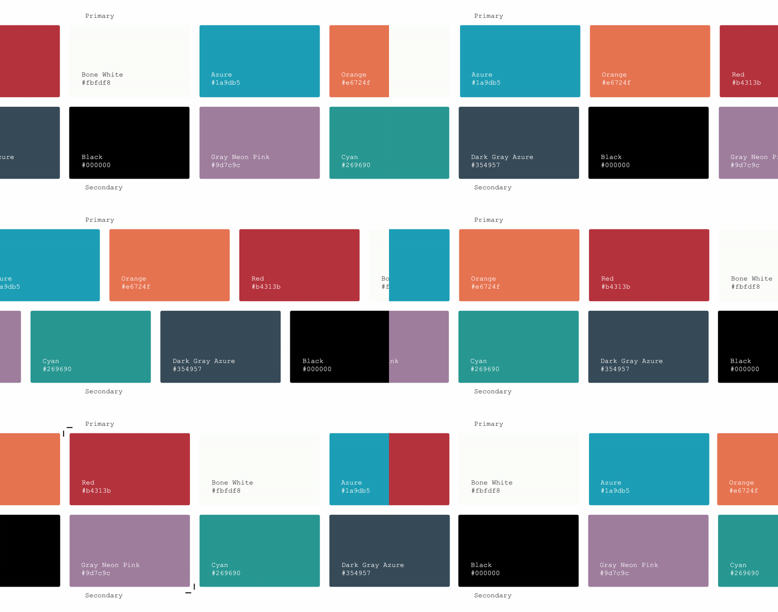
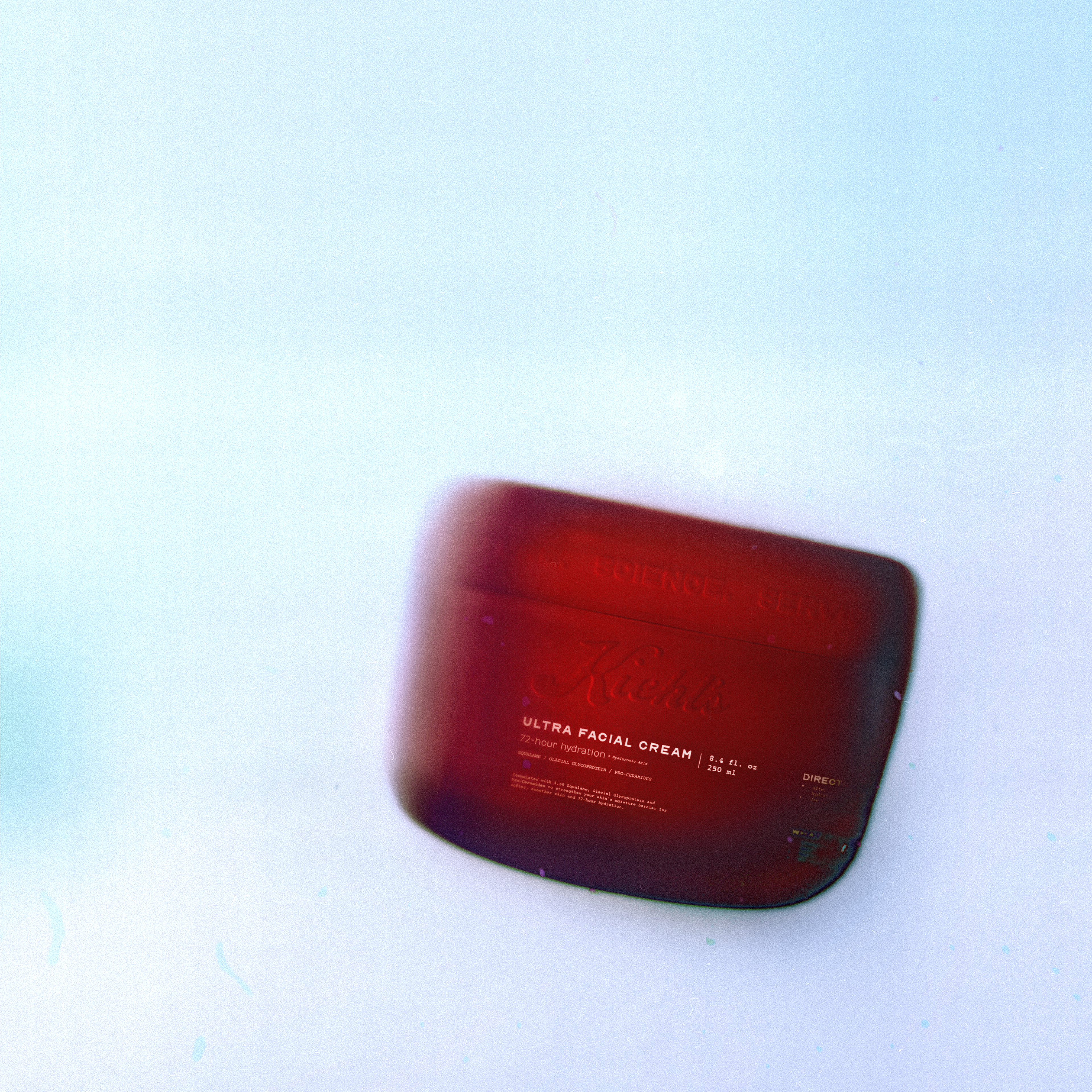
Kieh'ls visual identity and ethos is rooted in it's origins as an apothecary. They center themselves as the premiere choice for true change and education for skin care. For this rebrand, I wanted to double down on these origins and provide, even more, the feeling of a longstanding trustworthy brand, while also making the visual identity appealing to the new generation. A modern take to an apothecary. Throughout the visual identity, you will see vintage call backs, such as the use of a font like Courier to evoke a sense of nostalgia and raw transparent data, custom product design utilizing vintage glassware and medical and chemistry tools represented in a translucent manor to communicate the spiritual root of the brand being that of an apothecary.